How to Use the Map viewer
Welcome to the James Hutton Institute’s climate map visualisation tool.
Here you can explore how Scotland’s climate has changed since 1960, and what 12 different projections for the future look like. Details about the data used to produce the maps and a guide to the range of climate projection is available here:
Climate Trends and Projections
Guide to how to use the map visualisation tool:
There are two parts to the climate change map viewer: Observed and Climate Projections – see the tabs at the top of the pages.
The observed page: :
Climate Projections:
There are four options to view the climate projections data and maps:
Change maps;These show the changes in the mean of a climate variable (e.g. Maximum Temperature) per month between 1960-1989 and two future periods (2020-2049 and 2050-2079).
Change maps show the differences between the 1960-1989 baseline period and the selected future period.
Change direction maps show the direction of change, as either Increase (blue), Decrease (red) or No Change
(yellow) in the value of the selected variable.
An option is provided to view the observed baseline map as well as the future projections, to help comparisons – select the ‘Show baseline map’ option.
Note: the ‘Add summary stats’ option is not yet operational.
Agreement maps;the maps show where there is agreement between different climate projections for how a weather variable may change in the future. Changes are given as Increase (blue), Decrease (red) or where uncertainty remain, e.g. no agreement between the projections (yellow).
Where all 12 projections agree the direction of change (increase or decrease), we can be more confident that such a change is more likely. Reducing the number of projections used tends to reduce the area shown as ‘uncertain’ (yellow), but decreases the level of confidence in the likelihood the changes will occur.
Features to look out for: Watch for locations where the direction of change is constant regardless of the number of projections used. This implies that the change is more probable.
Note: Precipitation is highly spatially variable, so there tends to be less agreement for it and the other climatic variables it used to calculate, e.g. evapotranspiration.
Projections anomaly; These plots help illustrate the variation in temperature and precipitation between the 12
climate projections used compared to the 1960-1989 baseline period. The values plotted are the differences between the
future and observed mean temperature and precipitation.
Two options are provided, either to view the Annual or Monthly anomaly, for two future periods (2020-2049, 2050-2079).
Example:By selecting the Annual and 2020-2049 options, Projection number 13 has a 2°C temperature increase and a 2.5% decrease in precipitation from the baseline. Conversely. Projection 15 has a 1.1°C increase but an 8-9% increase in annual precipitation.
Note:when using the Monthly plot option the precipitation (y axis) values are different per month, to allow for the size of the variation between projections per month.
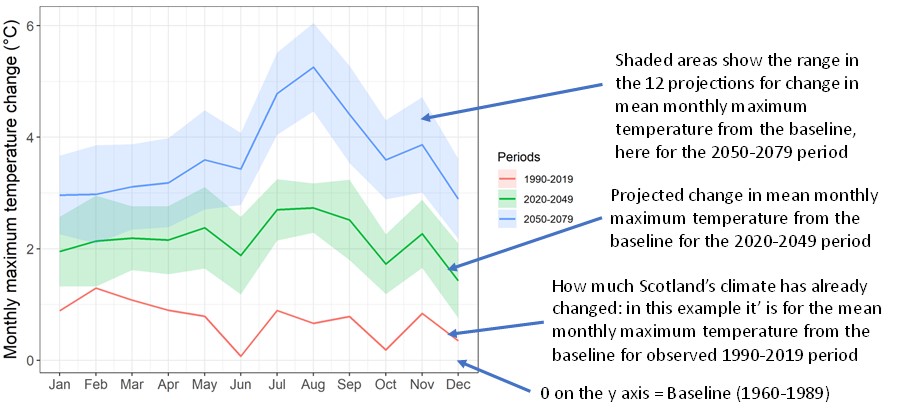
Monthly anomaly;These illustrate how, at the national scale, the mean monthly precipitation, maximum and minimum temperatures have changed between 1960-1989 (baseline, represented by the 0 line on the y axis), 1990-2019 and the two future periods.
The example below shows how to read the plots. Here, it can be seen that the mean monthly maximum temperature for February has already increase since the 1960-1989 period to be at the lower end of what is projected for the 2020-2049 period.

Acknowledgements:
This site has been developed through funding support provided by the Scottish Government Rural and Environment Science and Analytical Services Division (RESAS) Strategic Research Portfolio, Projects D5-2 Climate Change Impacts on Natural Capital and Project C3-1 Supporting Scotland’s Land Use Transformations. We would like to acknowledge the UK Meteorological Office and UKCP18 for use of the observed gridded climate data and future climate projections, and Ordnance Survey for the underlying base map.
Liability statement:
The information provided on this website is for visualisation purposes only on the potential future climate change affects and should not be used for decision making. The James Hutton Institute does not accept responsibility for any decisions made using the information provided.