All About the Agrometeorological Indicators and Summaries
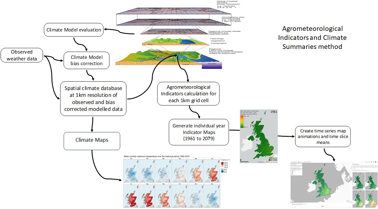
We use a suite of 35+ Agrometeorological Indicators and Climate Summaries produced using UK observed and climate model data to illustrate how different things determined by the global climate may vary from year to year, how they have changed since 1960 and how they may change in the future.
Agrometeorological Indicators examples include:
Climate Summaries:
Further detail about the Agrometeorological Indicators available Here,you can explore a wide range of climate maps and data, including.
About the climate data used
The Indicators and Summaries have been estimated using daily data from the UK Meteorological Office and the UKCP18 Climate Projections.Guide to choosing a climate projection
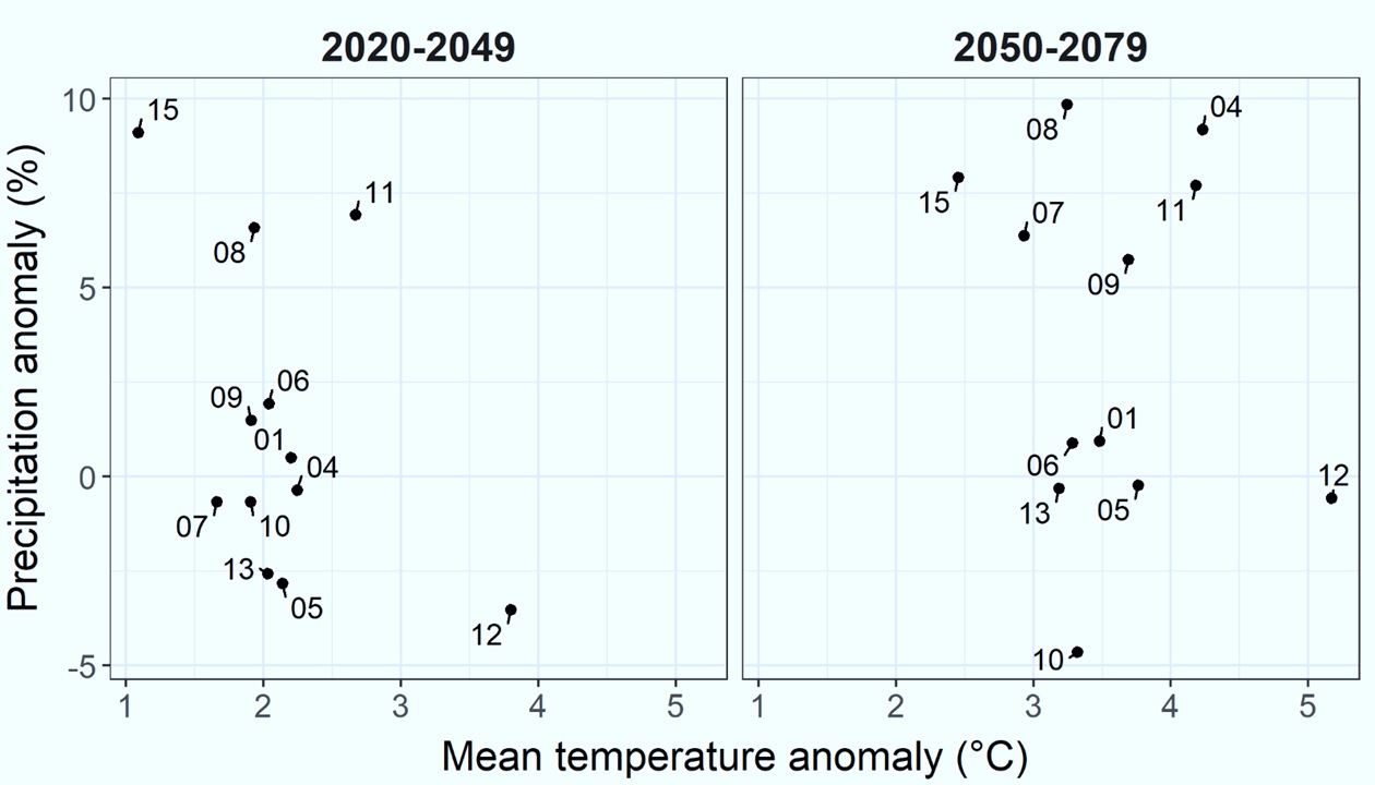
The 12 climate projections represent a range of possible climatic changes. Use the figure and summary table below to identify a projection (Ensemble) number you would like to see the maps for. This graph shows the anomaly (or difference) in temperature and precipitation between a future projection and the baseline period (1960 – 1989) at the whole UK scale.
For example, Projection 01 has a similar total annual precipitation to the past (1960-1990 baseline) but has a temperature increase of 2.1°C in the 2020-2049 period. Similarly, in the 2050-2079 period, Projection 15 the mean annual temperature increase over the baseline is 2.5°C and has 5% less total annual precipitation.
Note: The anomaly graph and associated summary table can look different depending on where in the country the anomaly is estimated for, and which season. There are large regional spatial variations and differences between months and seasons, meaning this anomaly graph and table is different for example between northwest Scotland and the southeast of England.
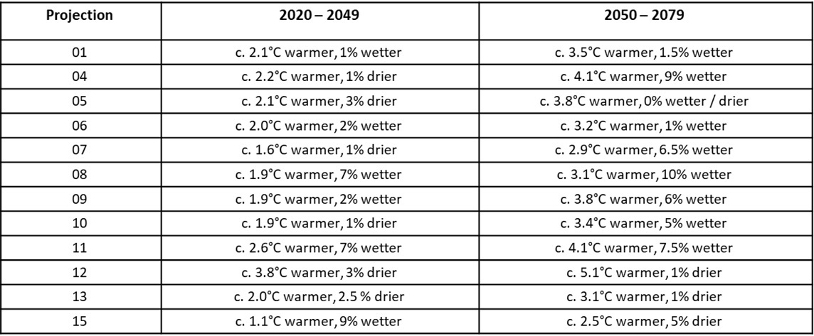
Summary table of projections:
Summary for the 2020 – 2049 and 2050 – 2079 periods for the whole UK over the entire year compared to the 1960-1990 baseline.
How to use the maps
Step 1:
Select the climate projection (ensemble member) you would like to explore. 12 climate projections and the mean of all 12 (ensemble mean) are available. Use the ‘climate anomaly’ graph to see what each projection means in terms of its changes in temperature and precipitation from the historical baseline period.Step 2:
Select the Agrometeorological Indicator or Summary you would like to see.Step 3:
Press Play.Some features to look out for
Caveats to help understand the use of the maps
There are several important things to consider when understanding the maps:- The observed spatial baseline data (1961-2019) is produced using a spatial interpolation method that estimates precipitation and temperature data for locations where there are no UK Meteorological Observation Stations. In other words, the method ‘fills in the gaps’ to provide data for every 1km grid cell for the whole UK. This method works well where there are many Met stations and relative uniform topography, but less well when there are larger distances between stations and in mountain areas.
- The future projections are based on a ‘high emissions trajectory’ and a higher level of radiative forcing (how much heat is trapped by the greenhouse gas effect’). However, the 12 projections used represent a range of plausible future climatic possibilities, including those that may arise from lower rates of emissions and levels of radiative forcing, i.e., those with less of a temperature increase from the historical baseline period.
- As with the interpolated observed baseline, the utility of the future projections is not as good in mountainous areas as it is in lowland locations.
- Coastal sites: some care is needed in interpreting the temperature-based results for cells where there may be a large proportion of the 1km cell that contains sea rather than land. This is because in the climate model data, the temperature over the sea is much cooler than over land. The bias correction method helps reduce this issue, but not completely.
Acknowledgements:
This site has been developed through funding support provided by the Scottish Government Rural and Environment Science and Analytical Services Division (RESAS) Strategic Research Portfolio,
Project C3-1 Supporting Scotland’s Land Use Transformations.
We would like to acknowledge the UK Meteorological Office and UKCP18 for use of the observed gridded climate data and future climate projections,
and Ordnance Survey for the underlying base map.
Liability statement
The information provided on this website is for visualisation purposes only on the potential future climate change affects and should not be used for decision making. The James Hutton Institute does not accept responsibility for any decisions made using the information provided.